
Page four.

Okay, panel one we have action—full figures if you don’t count Cap’s toe.

Look at the reactions of the background characters, and the Torch, for that matter. So much is expressed so simply and so powerfully. The words underscore the attitude Captain America expresses in the picture, and the Torch’s reactions, physically and verbally, tells us that what we’re seeing is a big deal.

Panels two and three, action, full figures, all full figures, standard action depth.
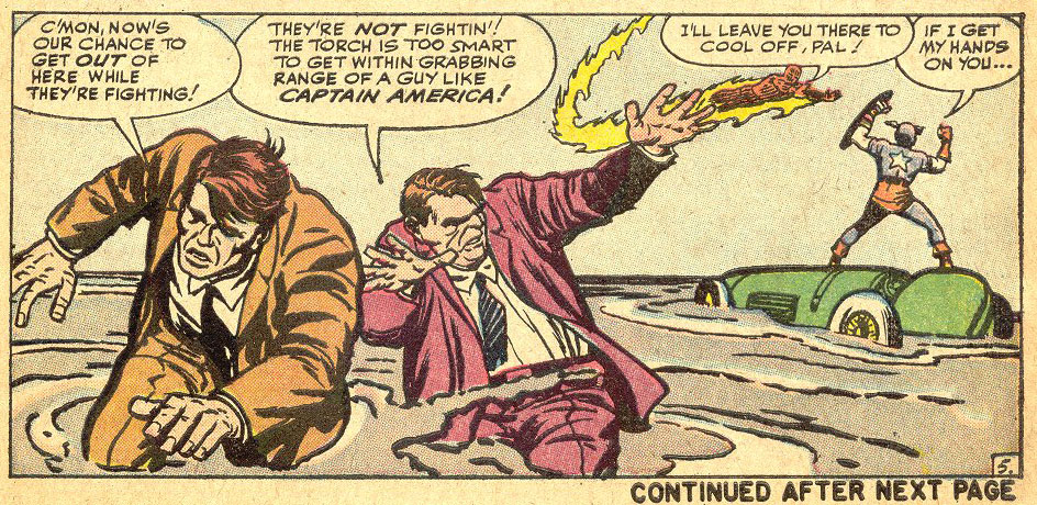
Page five.

Panel one. Action, full figures.
Panel two. Action, full figures.
Panel three. Action, full figures.
Panel four. Action, full figures. Anybody noticing a pattern, here?
Panel five.
Action, full figures, and he puts the crooks who are reacting close enough to the camera that we can see their expressive faces and gestures. The Torch and Cap’s emotions, farther away, are expressed in big gestures—and unmistakeable.
Page six.

Panel one.

Action, full figures with a couple of foreground figures cropped, suggesting that more cops are arriving. No one could possibly misunderstand this panel. The bad guys are being arrested. Clear at a glance. Notice that the Torch is seen in the background. Kirby wanted us to understand that this is taking place close by where the Torch and Cap are, giving us comfort regarding the location.
Panel two.

Reactions, all close up. Standard operating procedure. And brilliantly conveyed.
Panel three.

Back to action, full figure on Cap. An expressive hand, foreground and just look at the big-gesture excitement background. Hooray!
Panel four.

Action, full figure. The Torch is flying away. Note that this is the FIRST TIME KIRBY HAS TILTED THE HORIZON! In every other shot to this point, the horizon is DEAD LEVEL. Don’t be confused by the upshots and downshots. Look for things in each panel that should be vertical. They are. Every single panel to this point is level-horizon. Trust me, or get out your drafting tools. Kirby moves the camera up, down and all around, but very seldom tilts it off level.
So why did he tilt the camera thirty degrees or so to the left here? He had a reason. The Torch is waaay up in the air, and he wanted to give the readers a little of that airplane banking feeling, a little vertigo.
DC Comics used to give new artists a copy of a page drawn by Ric Estrada, that they referred to as the “perfect page.” It had a close up, a long shot, a medium shot…. And the horizon was tilted in most, if not all of the panels, to make it “more exciting.”
Stan and I used to look through a DC comic book once in a while and laugh out loud at some of what we saw—Superman landing with one foot tucked up under his butt, a totally unnatural pose—who would do that?—a ballerina?—panels that had captions saying, “Green Lantern fires his power ring,” in which the art showed Green Lantern firing his power ring and Green Lantern had a thought balloon, “I’ll fire my power ring,” and all the horizons in every panel were tilted.
More exciting? Nah. Just made me seasick, or made me wonder if there was an earthquake going on.
But I digress….
Yes, we at Marvel screwed up too, sometimes. And, yes, I am guilty as charged. I did stupid stuff. Hey, I was young. I got better. Or less stupid. Whatever.
Am I saying you can’t tilt the horizon? Nope. I’m saying DO IT FOR A REASON. Do ANY trick shot for a reason. I recommend doing things for a reason. More on that later.
One more thought regarding tilted horizons. Do you guys go to movies? How often does Cameron tilt the horizon? Spielberg? Lucas? Anybody noteworthy? GET A CLUE! Only comics guys, among all visual storytellers, for reasons mysterious to me, except that DC preached it and required it for a long time, routinely and stupidly, meaninglessly, tilt the horizon. Feh.
Panel 5.

Here we cut to new scene. This is one of the places where comics have a problem because ideally, you want to end a scene on the last panel of a page and start a new scene on the next page. But Kirby has only 100 panels and he had to make a compromise. He was also probably doing this fast—he probably was doing five pages a day—so he couldn’t think about it too long. This is all on instinct. That’s what’s amazing—it’s all on instinct.
So, he’s got a lot to do here. He’s got to show the Torch reacting to something, he’s got to show what he’s reacting to, a newspaper, he’s got to introduce the characters, he’s got to be close enough so we can get a look at the new character, the Torch’s girlfriend, Doris. But he’s got to be far enough away so we can see the bit of business she’s doing—serving sodas—and he’s got to establish the new location.
He does it. The guy’s a genius. He’s amazing.
Payton
Both OpenID accounts "cyxodus" and "Payton" are me. I'm having trouble with their site.
Payton
I agree. A lot of today's comics aren't really reader friendly and aren't laid out well. They either have dark borders, weird angled panels or panel busting art. Nothing on Kirby's level.
The late 80's artist movement had the effect of throwing Kirby's handbook out of the window. The result is art for artists but not for the reader.
Jim Shooter
Not necessarily. But I recommend doing either of those things sparingly, and only for a good reason.
cyxodus
Jim,
When an artist creates a slanted panel, does that tilt the horizon even if the art in that panel isn't? Prime example of this is Amazing Spider-man #651, page 10.
Bob Lilly
Jim,
I like these posts and find them instructive. Jack Kirby once told me, "Remember, your job is to tell the story. You can throw in a lot of razzle dazzle if you want, but don't let it get in the way of telling the story." You have another version of this essential truth.
Thanks for your posts.
Jim Shooter
Kirby, back then, drew fast, I know for sure. I think getting the story across was first on his mind, tangents priority #32. I'm guessing, of course. Anything that tells the story better is desirable. Anything done to impress the artistes in the crowd is counter-productive, in my mind. And in Kirby's, I suspect.
Yes, I was encouraged to do tilted horizons while I was at DC in the '60's. I generally didn't, but sometimes the artists working from my layouts would tilt the camera whether I liked it or not. Even Curt Swan.
Marc Miyake
Dear Jim,
What's your take on tangents? There are quite a few in this story: e.g., the tip of Cap's left boot is touching the panel border in page four, panel one. Some might say that makes Cap seem confined whereas others might say that it creates the illusion of Cap jumping off the edge of the panel. The author of this page on tangents might object:
http://emptyeasel.com/2008/11/18/avoiding-tangents-9-visual-blunders-every-artist-should-watch-out-for/
Can tangents ever be desirable in storytelling (as opposed to landscapes and still lifes)?
Cap's right toes are cut off in that panel. When and where should things be cut off?
Were you told to tilt the horizon when you did layouts for DC in the 60s?
Most of us have to work very hard to even remotely approach what Kirby did on instinct *and* at top speed. The art tells the story so effectively that it doesn't draw attention to itself. (Pun unintended!) I can even follow the story without reading the words in the thumbnails or single-panel graphics – and without relying on my hazy memory of reading the story eight years ago. Kirby fluently "spoke" body language.